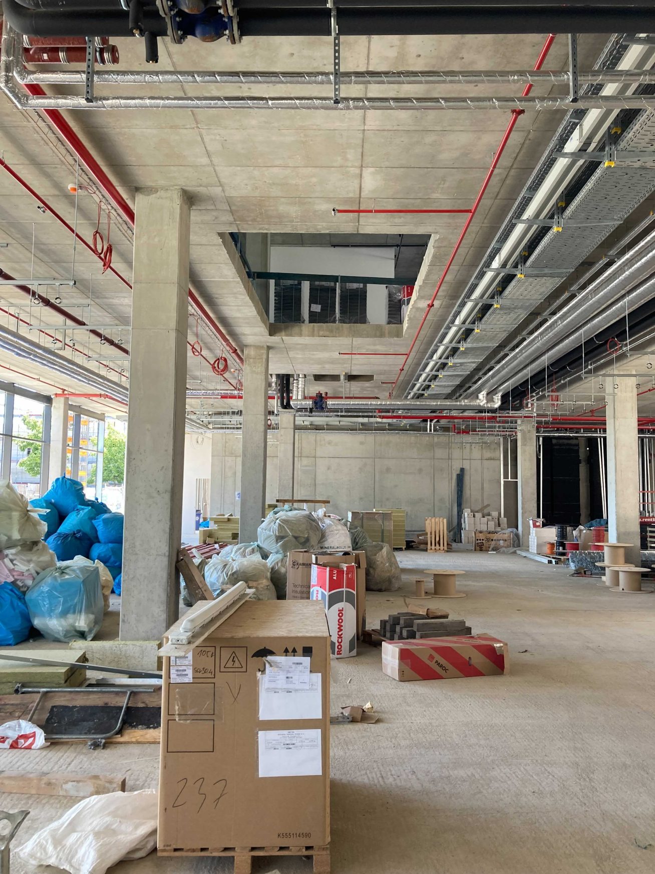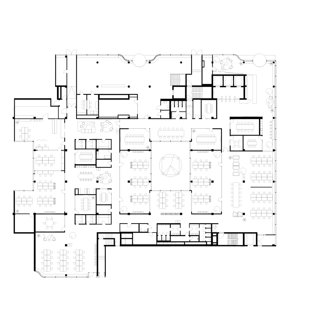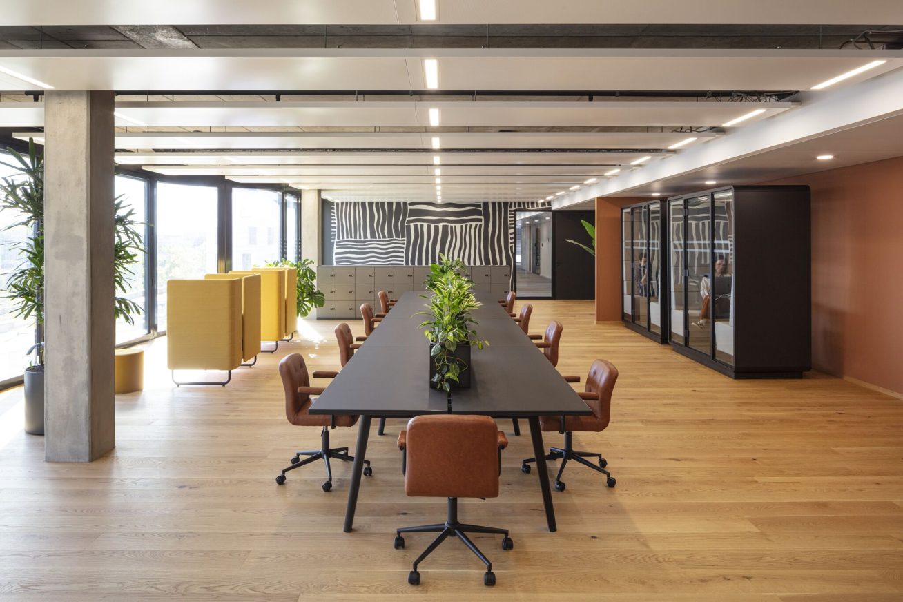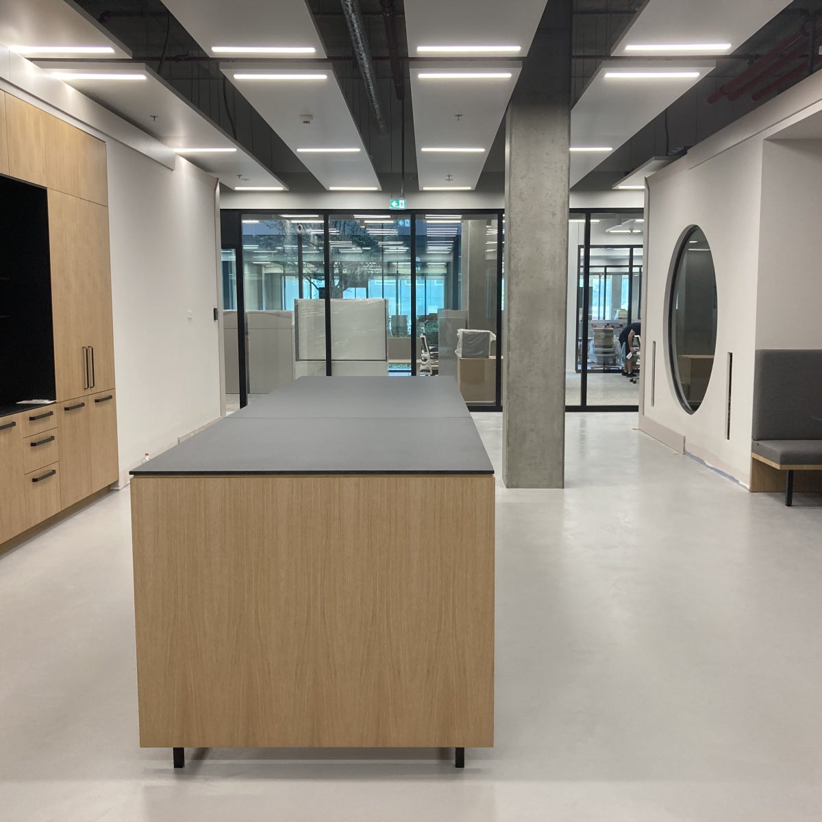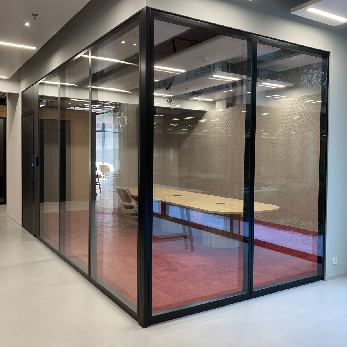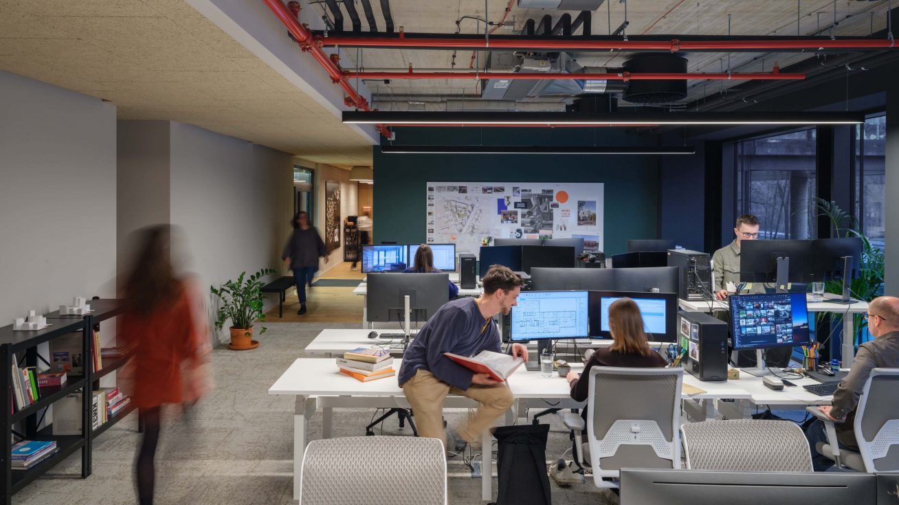
Modern DSTRCT.Berlin ‘s WELL Gold and DGNB certified office complex meets the highest standards of a modern workplace with a positive impact on wellbeing and productivity. In our proposal we wanted to support these values. As a stepping stone in planning the space, we used the document Workplace strategy and analysis report from Origameo, which the client had prepared before the work began. We therefore took the company’s requirements into account in both the final layout of the flexible workstationsas well as for the community zones. Here you will find a prayer room, a children’s room or a space for parents to work with their children, which are increasingly becoming part of company standards.
Design concept reflects the company culture and focus on type clientsa Business. The main motive
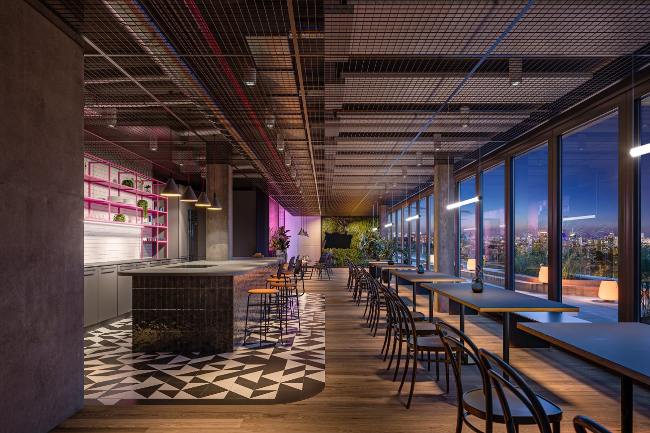
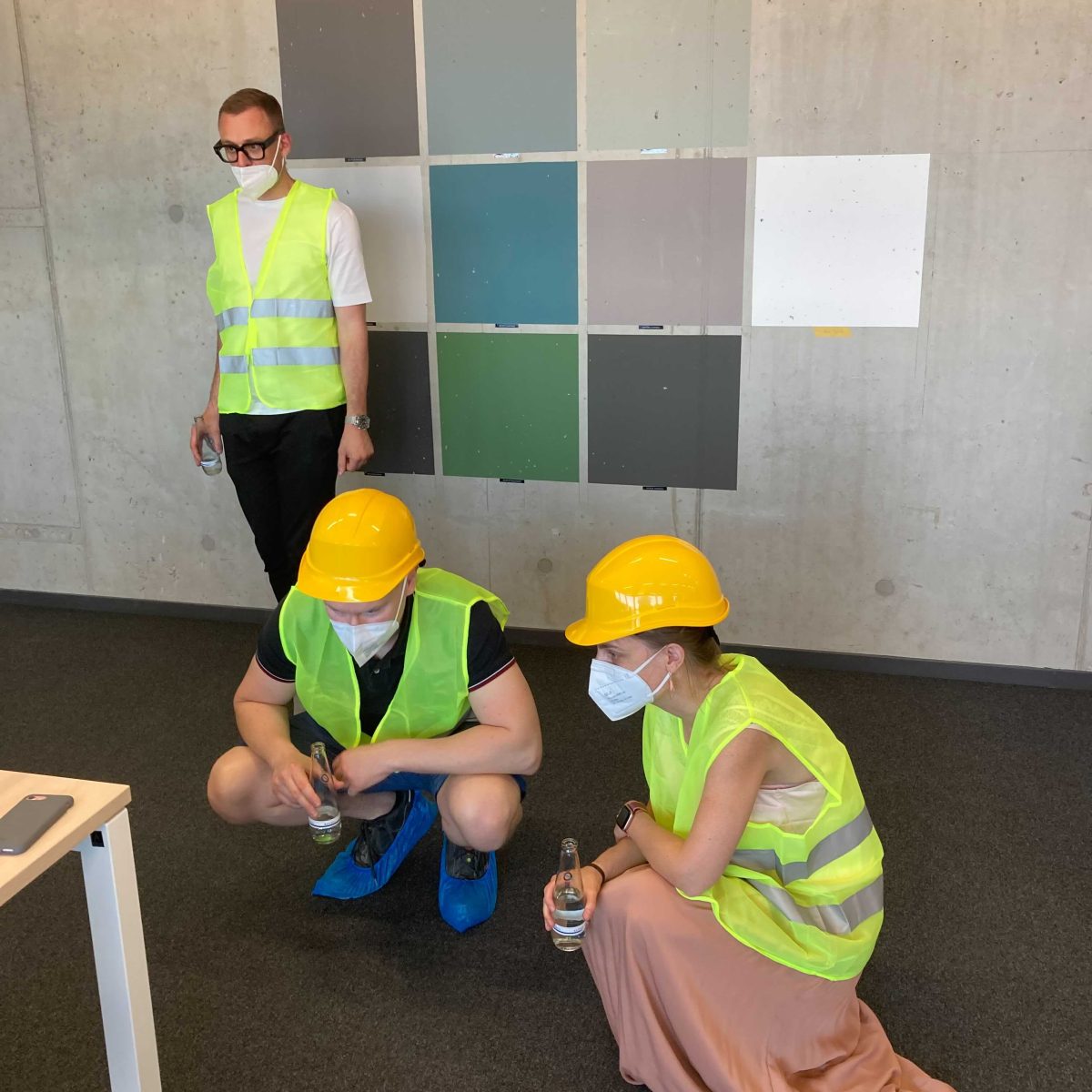
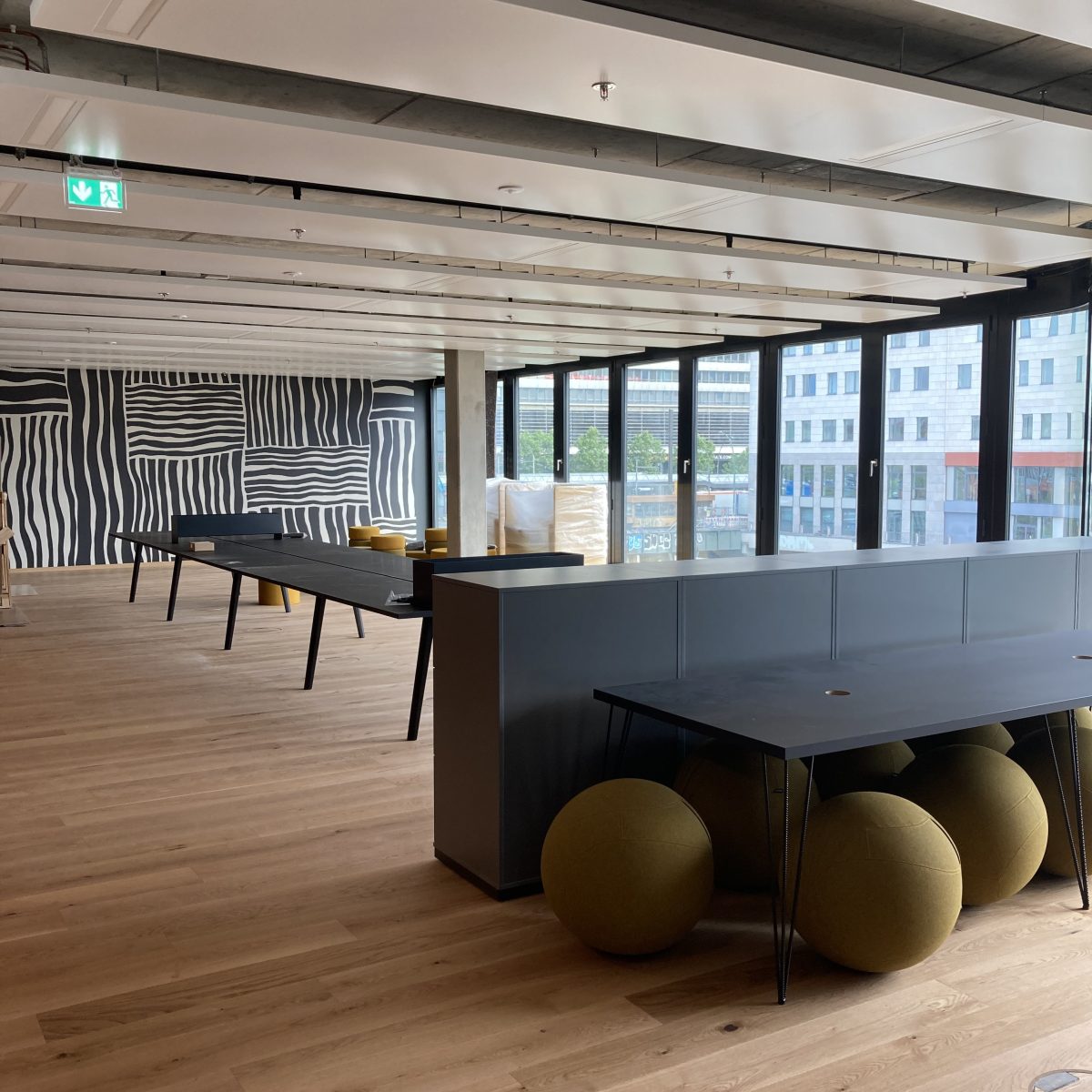
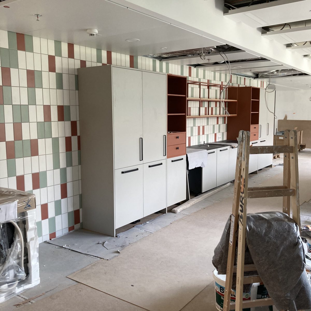
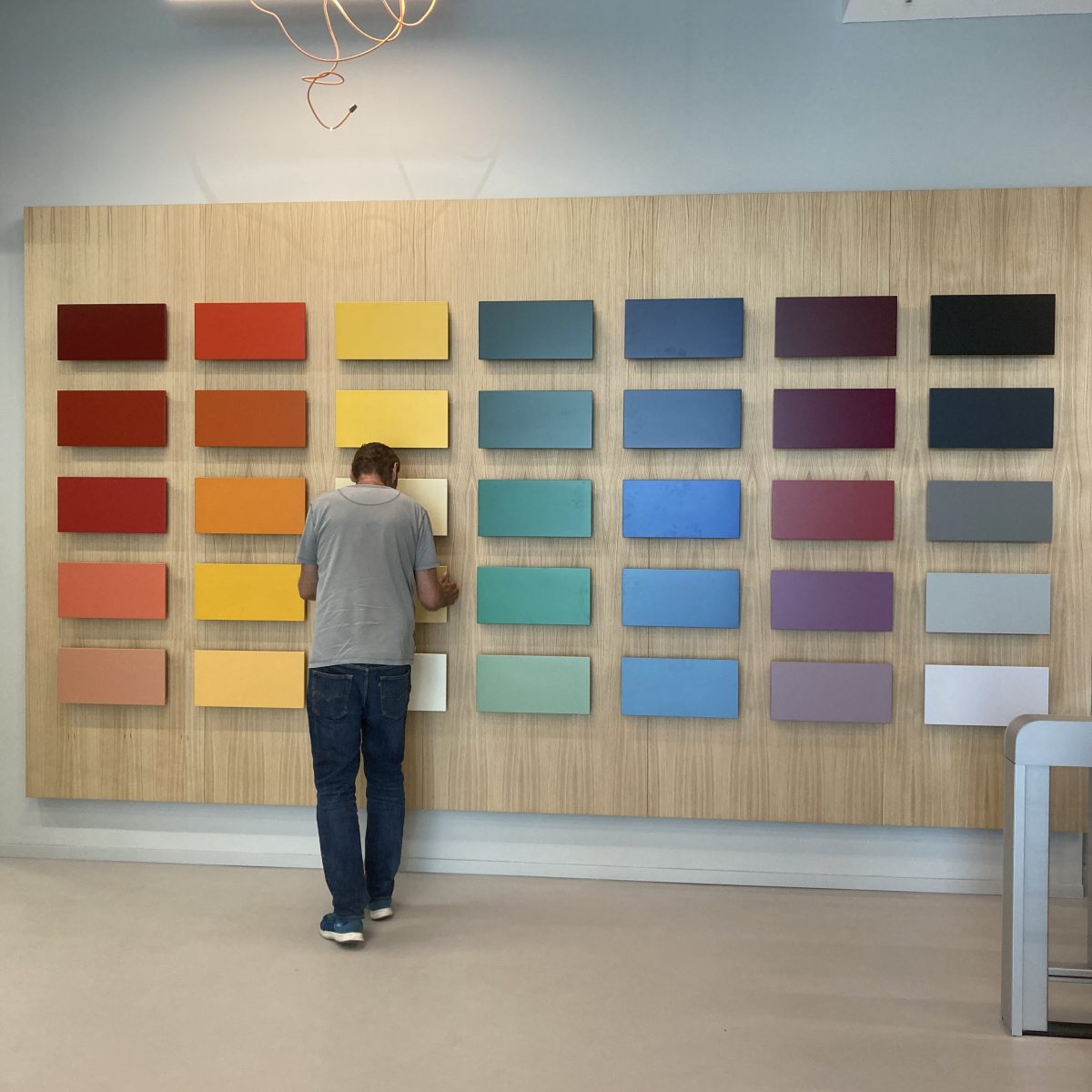
“home, away from home”, we have reflected in the design through styles that represent the company’s portfolio. On the seventh floor we work with a variety of colours and moods, that reflect the colorful atmosphere of Berlin.
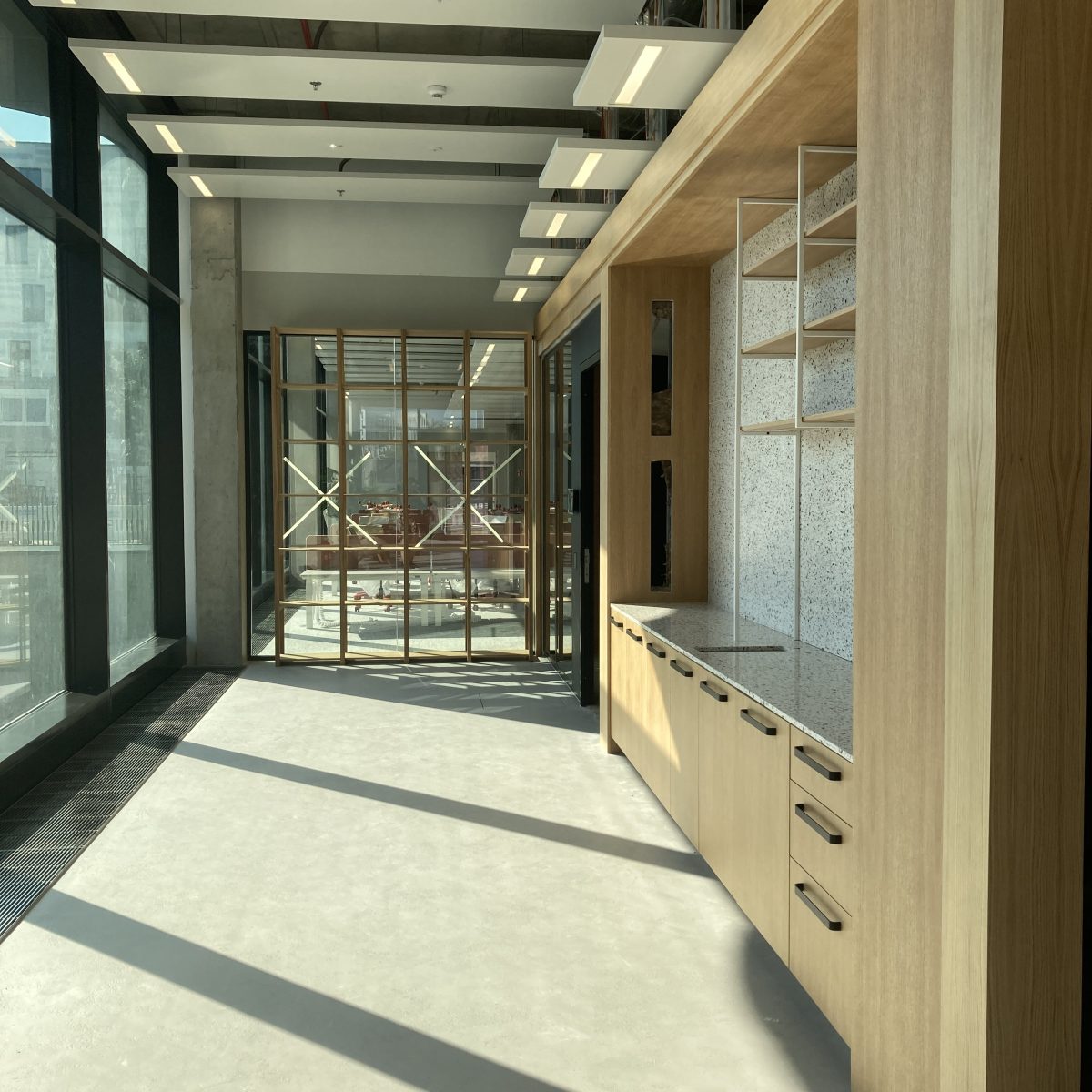
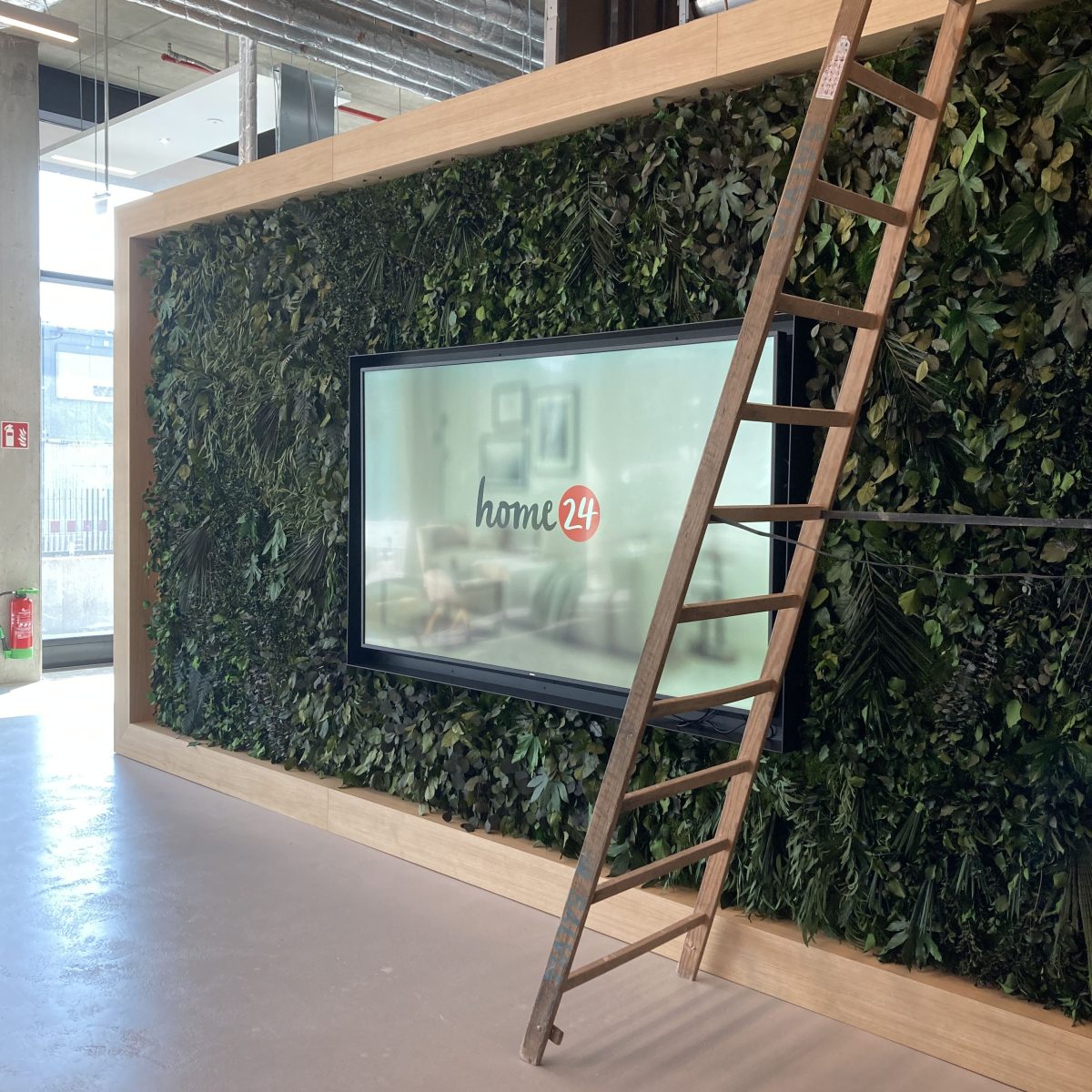
A significant criterion in the creation was to preserve theVanier the quality of jobs and meeting rooms. We had a discussion on the topic of design with the company’s art director and her team. The realisation therefore reflects the authentic identity of home24. The company selected individual pieces of furniture from its portfolio based on our references.
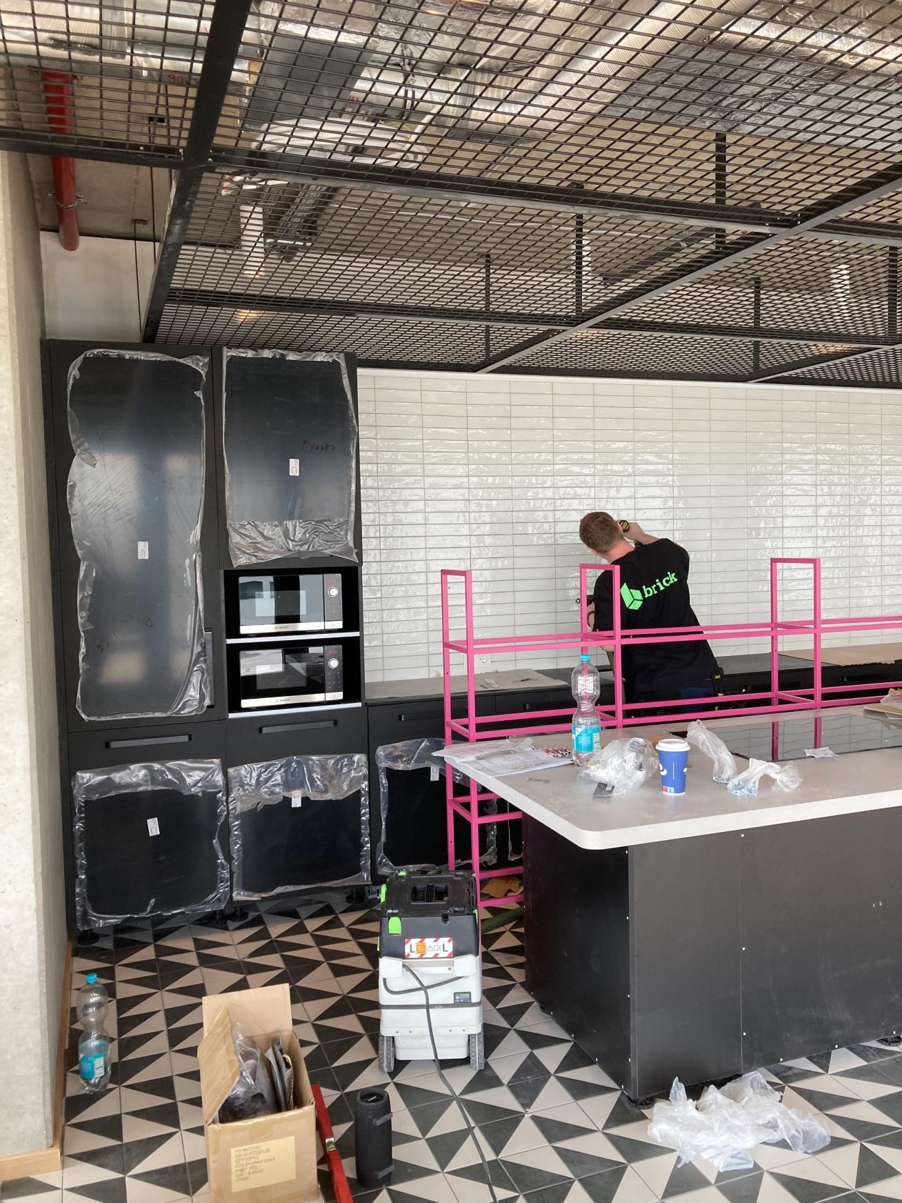
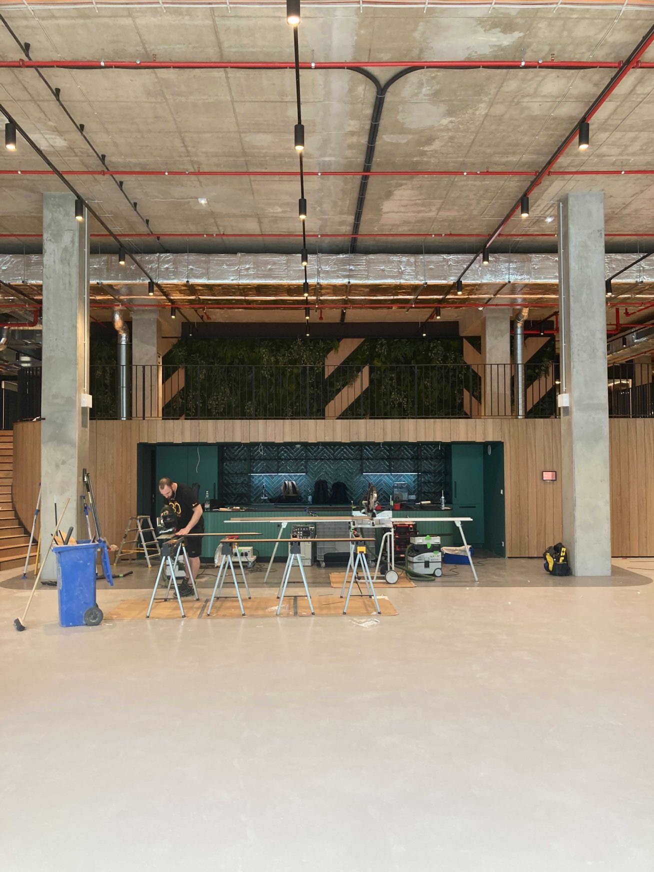
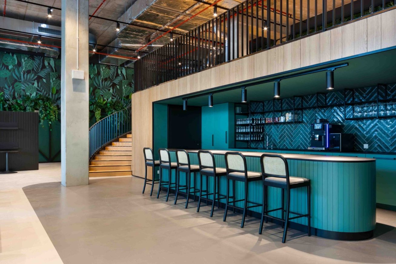
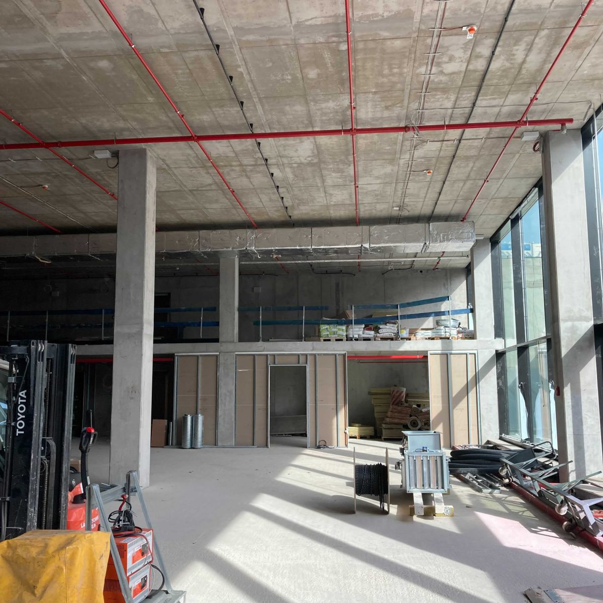
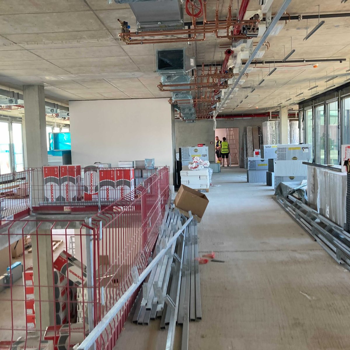
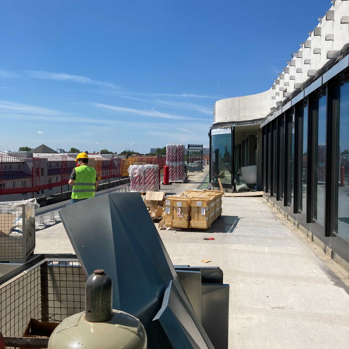
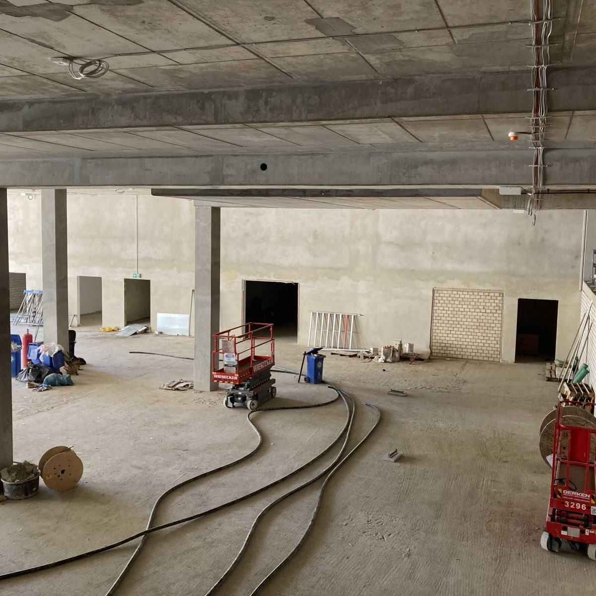
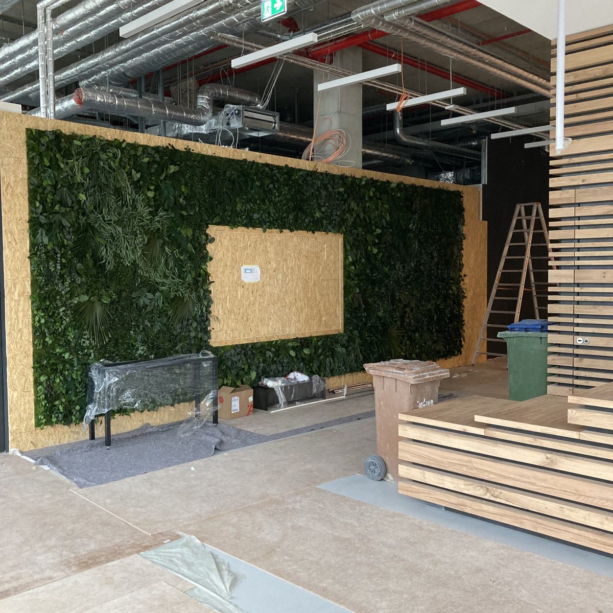
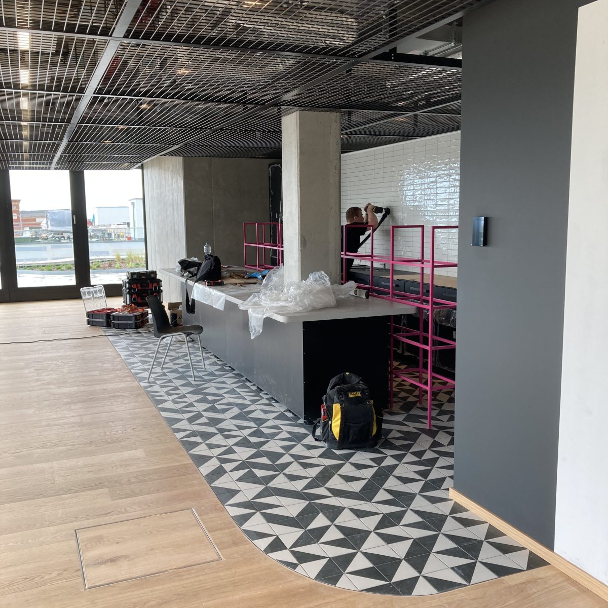
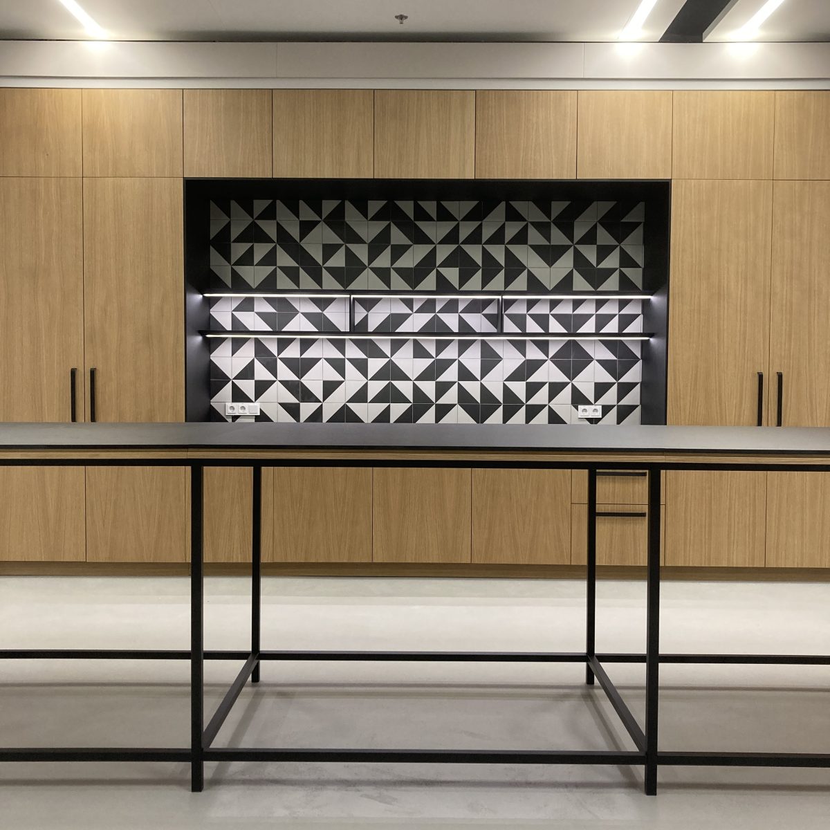
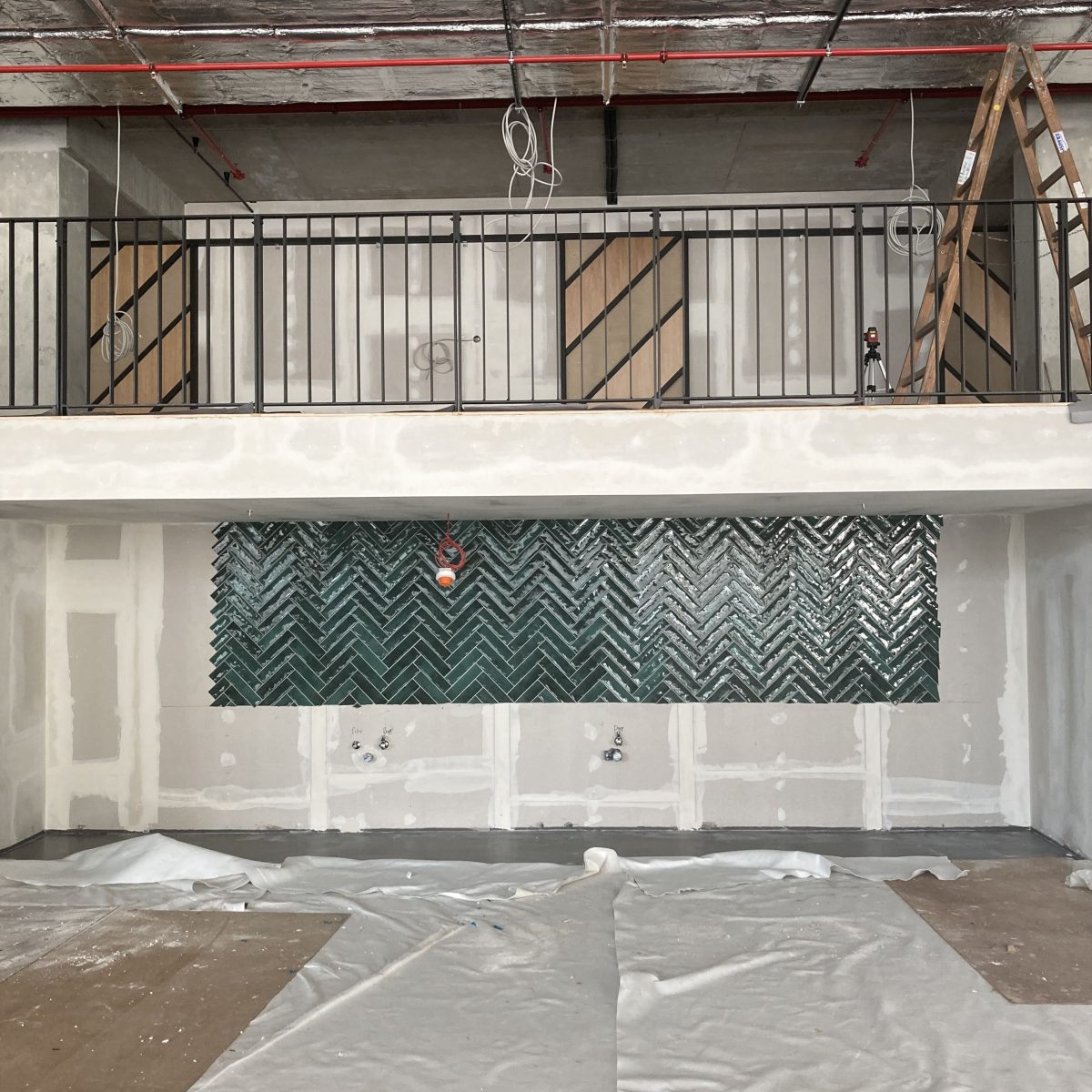
The company premises are located on 8 floors. Conceptually, we divided the individual floors into floors for work/meeting and entertainment. On the underground floors, employees can use a spectacular community space with a two-storey extension, adjoined by a multifunctional meeting room and a gym with facilities. The ground floor is designed for the common use of all employees. There are flexible workplaces and meeting rooms, all connected to the home24 showroom. The other 4 floors are used exclusively for work. We have designed the layout so that thein the middle was a common community area with a kitchen. The top floor is used for gathering and entertaining, and includes a rooftop terrace around the entire space. In short, the perfect place for a sky bar.
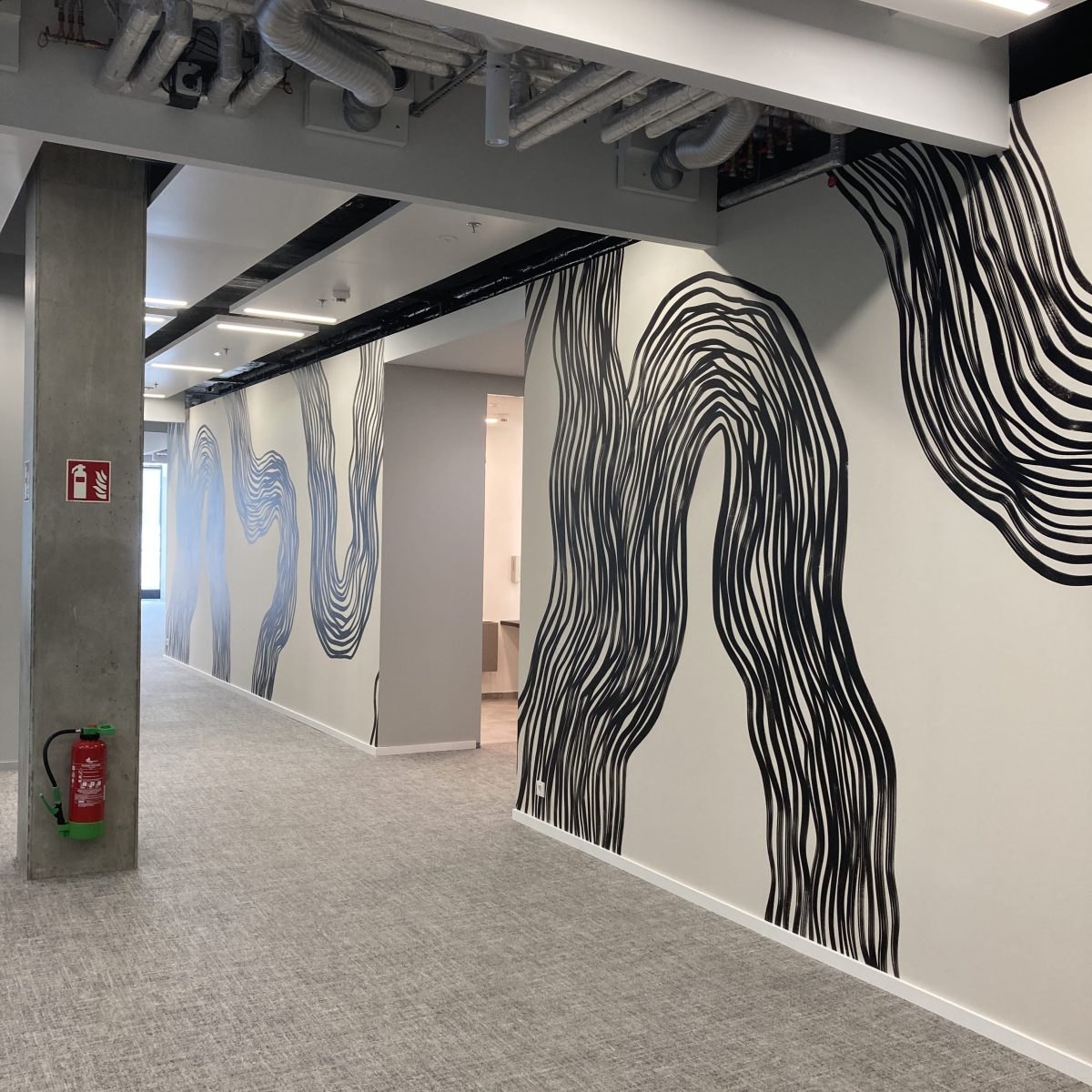
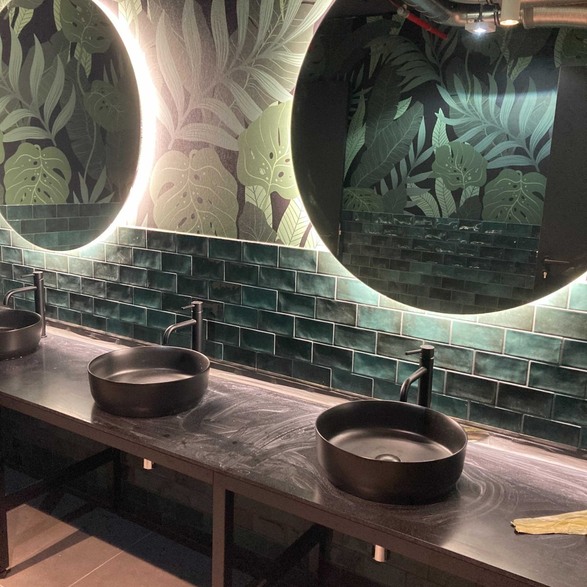
This complex and extensive project could be processed in the required detail and time thanks to the BIM software. The challenge was to coordinate our plans with the German architect of the building and the general designer of the fit-out. The complete project documentation as well as the documentation of the interior elements were submitted in English. Some German standards are much stricter than the Czech ones, so we had to pay attention to their requirements. The international dimension of the project was crowned by cooperation with the Swedish wallpaper brand Belarte, whose graphic designer prepared several customized motifs for home24.
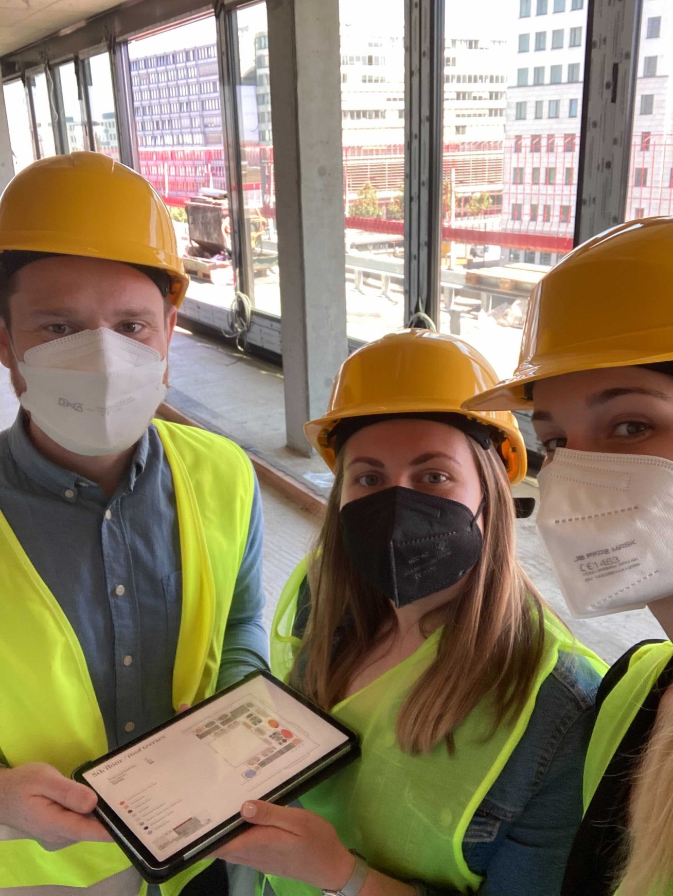
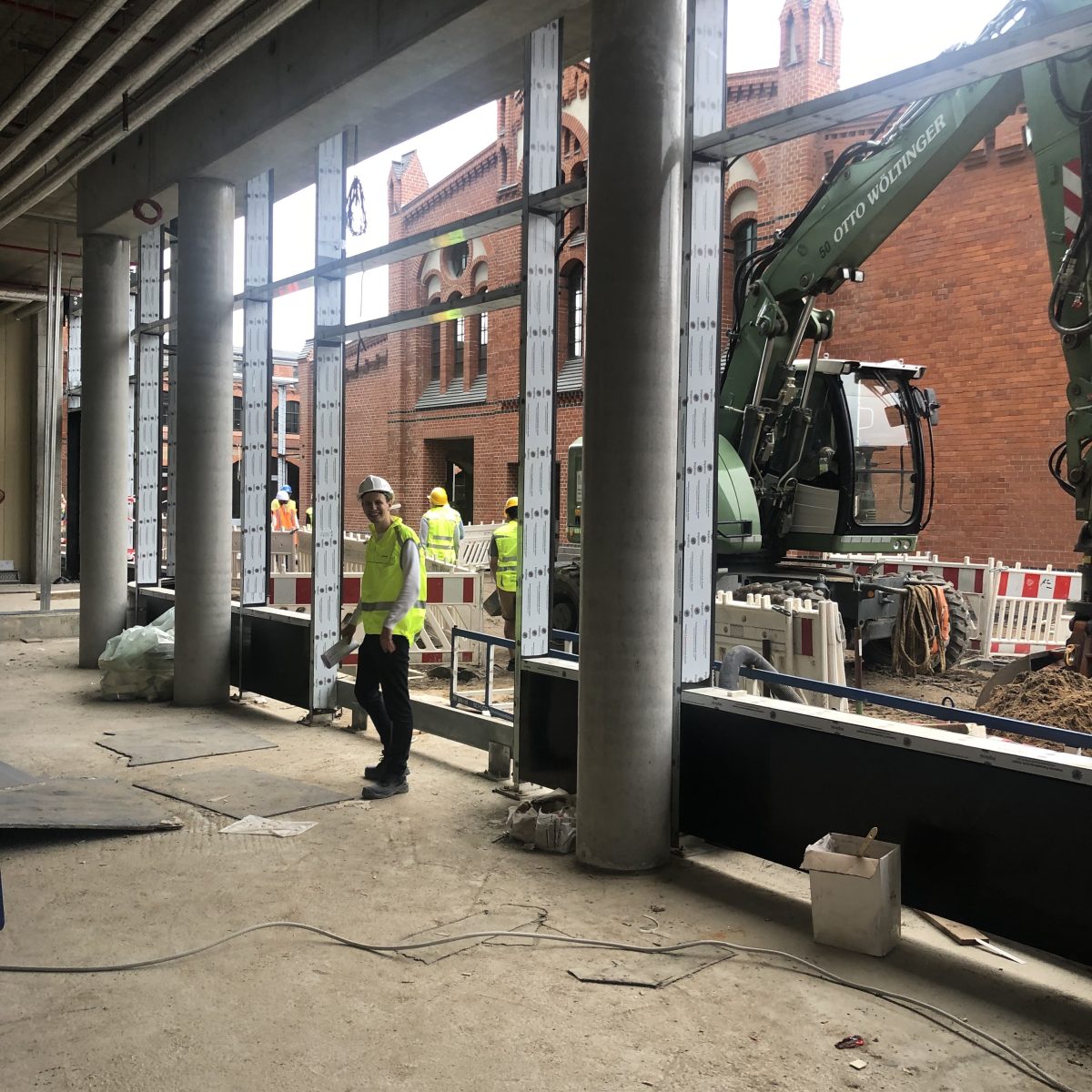
After this experience, Prague and Berlin seem closer than it might seem. We have managed to communicate a lot of things remotely and the rest we have dealt with at the regular inspection days.
Interested in visualizations and project details? Click on the link

